
Spot Quote
Type:
Pricing Workflow
Duration:
3 Months • Jan.25-Mar.25
Some of the specifics are under NDA, so a few details had to be abstracted.
The shape of the work, the thinking behind it, all of that is here.
Context
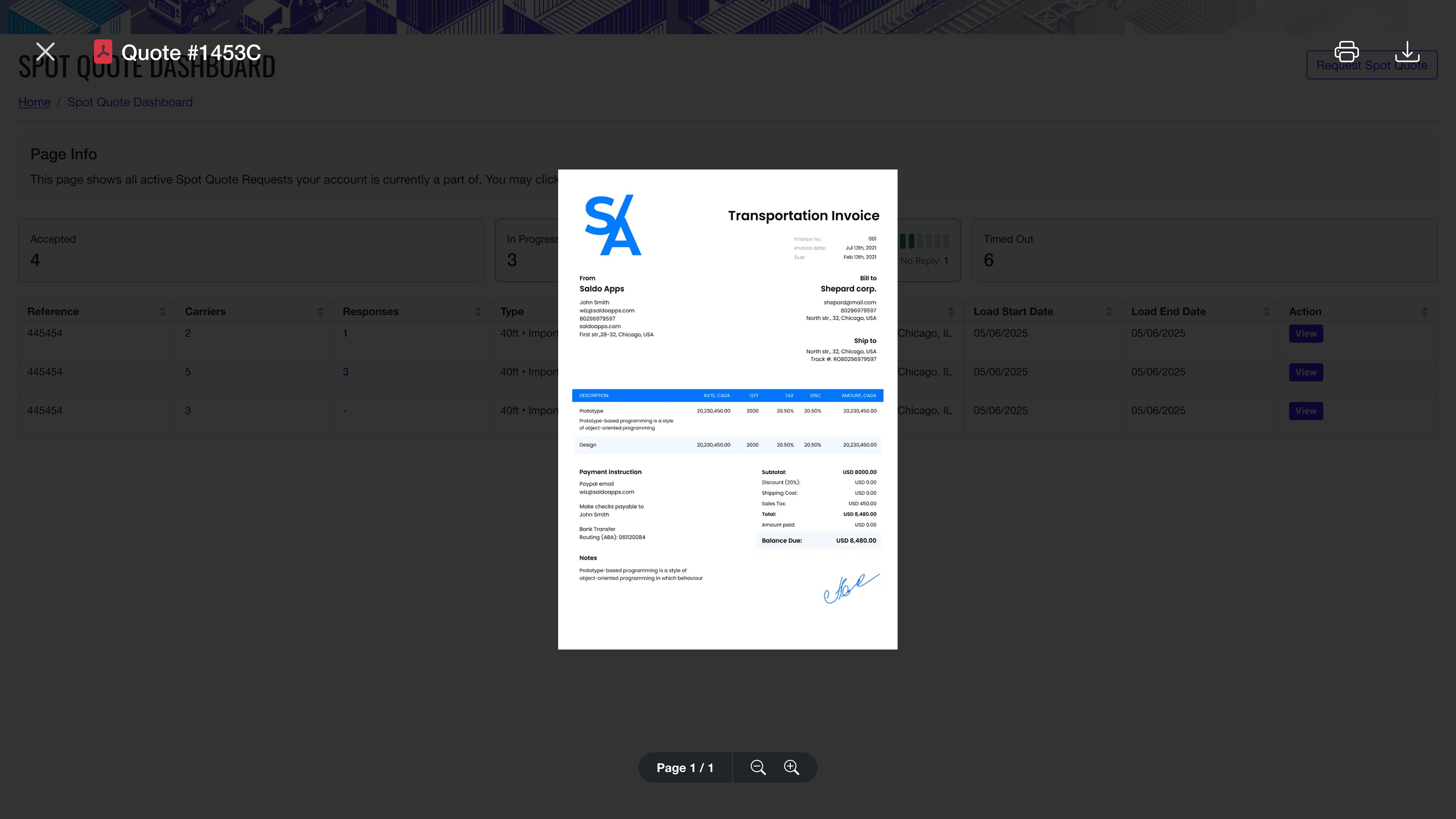
Spot Quote is part of Draymaster, the drayage operations platform built by WiseTech Global (the same company behind Cargowise). Drayage is the short-haul freight that moves a container between a port, a rail yard, and a warehouse. It's the messy first and last leg of intermodal shipping, and it runs on tight time windows and small margins.
A spot quote is the price a broker offers a carrier for a single, on-demand drayage job. Two roles, one transaction. The broker creates the quote and shops it out. The carrier sees the available work, looks at the numbers, and decides whether to take it. Different jobs, different mental models, different needs.
The tool they used to do this in didn't really know that.
Problem
The old spot quote tool was an internal product that had been around long enough to feel like it. One long form. No sections, no hierarchy, no guidance, no separation between roles. Every input lived on the same page, and you had to know in advance which ones mattered for what you were doing.
We talked to users across the experience spectrum, from people who had been in drayage for over twenty years to brokers and carriers with about a year on the job. The experienced ones could get through the form, but only because they'd been beaten into shape by it. The newer users frequently couldn't finish it without someone walking them through. That's a tool failing at its job. If your most experienced user is your help desk, the design is the problem.
A few things made this harder than a normal "redo the form" project:
Spot pricing is time-sensitive. The quote is live, the carrier is waiting, and there isn't space in the workflow for confusion.
Brokers and carriers were doing fundamentally different jobs in the same UI, and the old system treated them like one user.
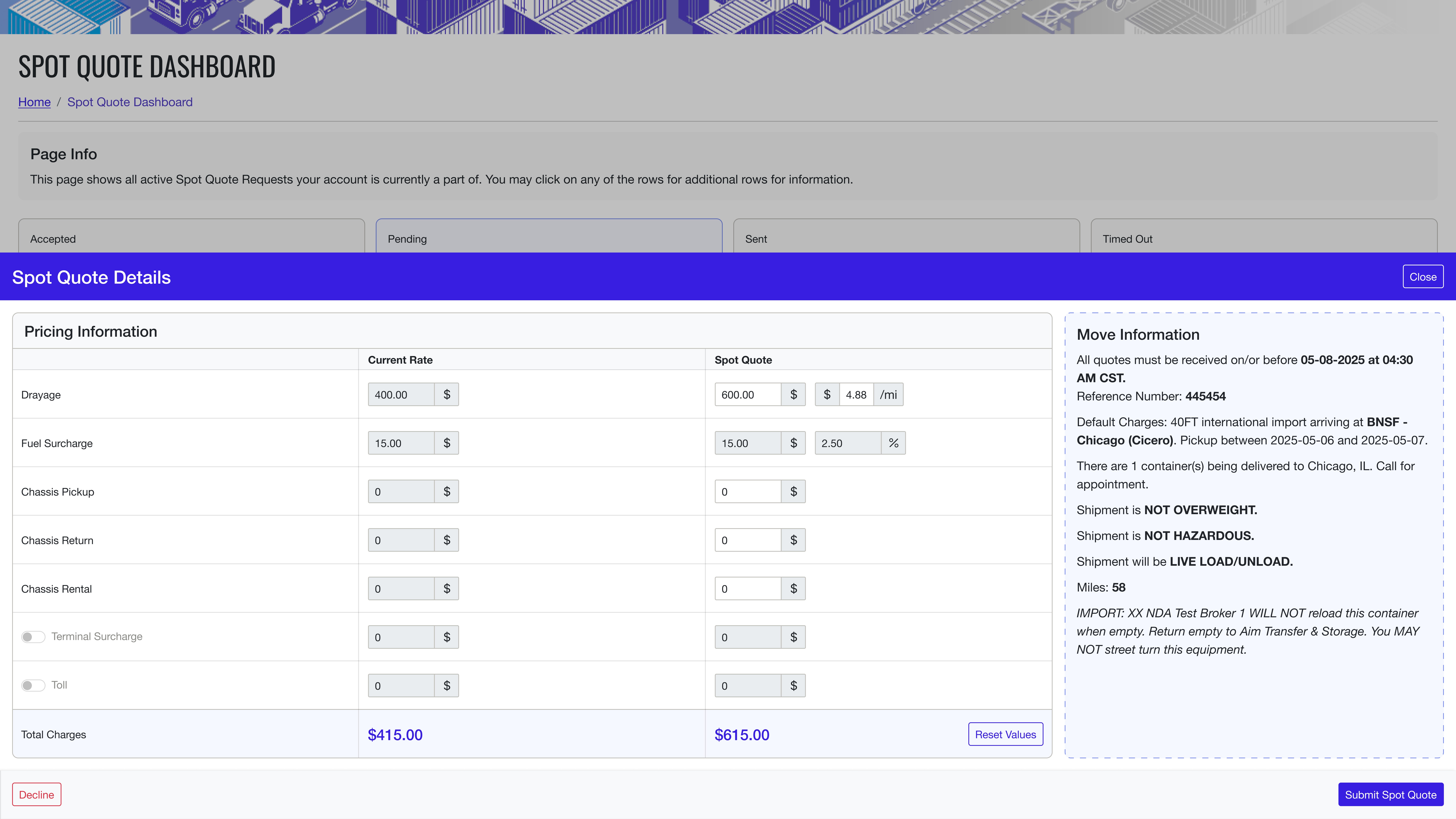
The data involved (routes, rates, container details, accessorials, deadlines) isn't optional complexity. It has to be there. The job wasn't to remove it, it was to give it shape.
The audience ranged from twenty-year veterans to people in their first year. The same UI had to work for both, without dumbing things down for one or burying the other.
Getting the brief right
Most of the first two weeks weren't about pixels. The old tool was confusing enough that we couldn't really design over it until we understood what it was actually trying to do. So we sat in meetings with the Draymaster product team (about eight to ten people from the side that actually used the tool every day) and asked a lot of questions. What's a spot quote, in your words. Why does this field exist. Why is this one optional. Who fills it out, who reads it, what happens when they get it wrong.
A couple of meetings in, two things were obvious. First, the product team knew exactly what the tool needed to do, they just hadn't seen it laid out cleanly before. Second, the broker and carrier flows were doing genuinely different things, and the old design had quietly merged them because nobody had ever stopped to separate them.
That second realization shaped most of what came next.
Solution
The redesign came down to two big calls. Break the form into a guided flow. Split the broker and carrier experiences into their own products.
A multi-step flow instead of a single page. One screen per logical decision. Each step explains what's being asked, why it matters, and what comes next. The complexity didn't go anywhere, it just stopped showing up all at once. A new user can move through the flow without being onboarded by a colleague. An experienced user can move through it fast, because the steps follow the order they were already thinking in.
Definitions and guidance in context. Drayage terminology is dense (chassis splits, accessorials, demurrage windows), and the old tool assumed you knew all of it. The new flow doesn't. Hover any term, see what it means. Look at any field, see what it does and why it's there. We stopped treating context like clutter and started treating it like part of the form.
Hierarchy that actually means something. Primary actions live on top. Secondary stuff (advanced options, edge case toggles, large reference datasets) gets pulled out into bottom drawers and modals. You can reach it whenever you want, but it doesn't fight for attention with the things you actually need to fill in.
Validation as you go. The old tool let you fill in something wrong and find out at submission. The new one catches it at the field. Less rework, less frustration, fewer half-finished quotes sitting in the system.
Two dashboards, one for each role. This was the call we had to argue for, and it was the right one.
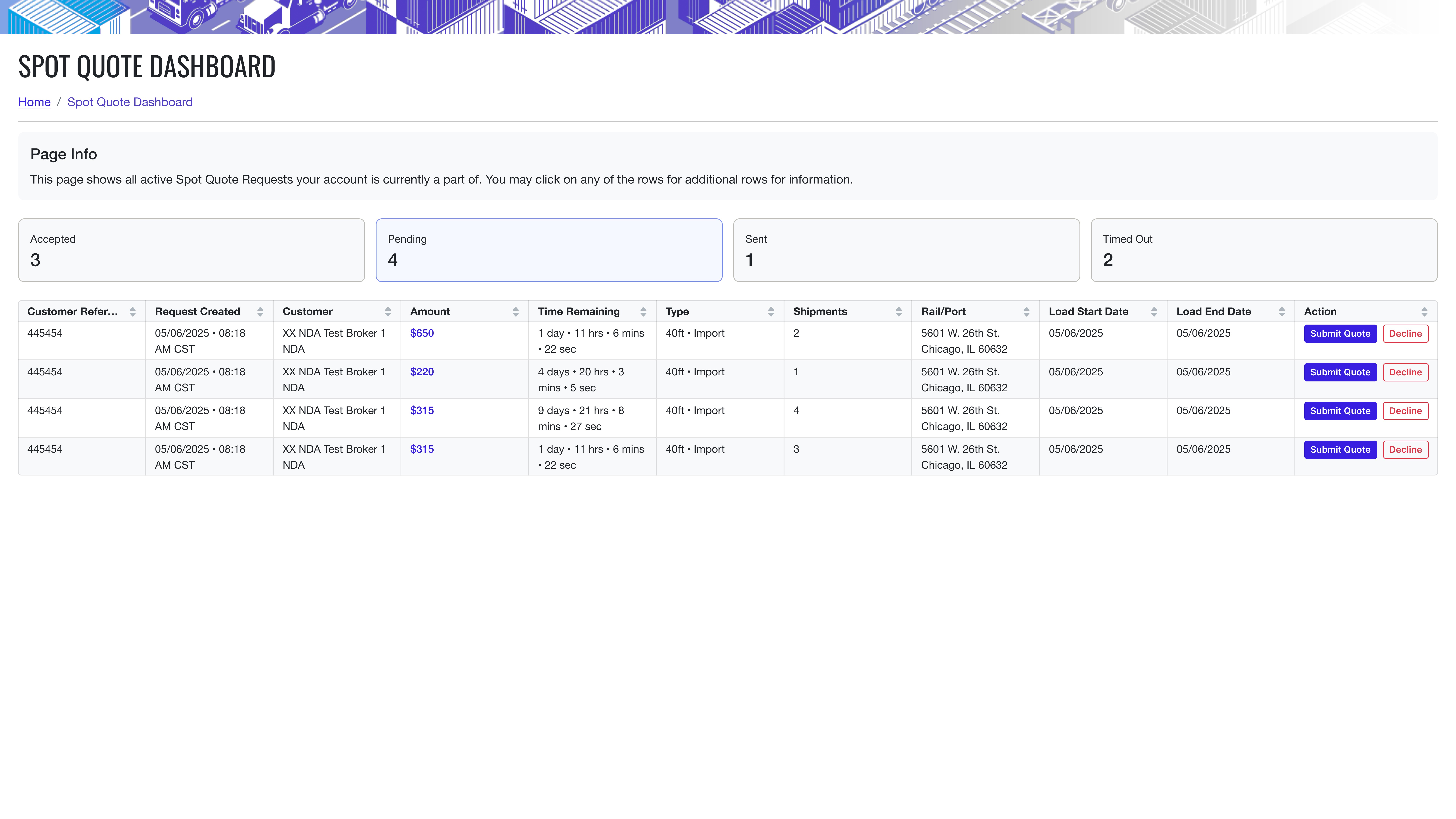
Brokers needed a dashboard built around quote creation and follow-through. Which quotes are out. Which have been accepted. Which have timed out. Where to push next. The whole thing is oriented around the action of selling.
Carriers needed something completely different. They aren't creating quotes, they're responding to them. So their dashboard is built around incoming work. What's available. What does it pay. What are the requirements. Are the windows realistic for the lanes I run. None of the broker-side complexity (pipeline tracking, follow-up logic, pricing strategy) belongs anywhere near it.
Same data underneath. Two completely different surfaces on top.
Making the case for the split
The broker and carrier roles were always there, the old tool just hadn't honored the difference. When we proposed splitting them into two full flows, we had to make the case to the product managers.
The argument was simple. Both sides are filling in forms in the old tool, but the forms are asking them to do opposite jobs. One is selling, one is buying. One is starting a transaction, one is responding to it. Forcing them through the same UI doesn't save effort, it doubles the cognitive load on both sides, because each role has to mentally filter out the half of the screen that isn't for them.
The product team was a good audience for this. They'd lived inside the old tool long enough to know exactly which parts hurt, and once the split was on the table, they could see it clearly. The decision moved pretty quickly after that.
Outcome
We tested the redesigned platform with 15 brokers and 15 carriers, recruited across the full experience range. Beginners with about a year in the industry, veterans with twenty plus, and everything in between. Then we measured what changed.
Average time to complete a quote on the broker side dropped from 19 minutes to 7. Same data inputs, same logic underneath, just structured to follow how people actually think.
Error rates dropped by around 40% across the testing group, driven mostly by inline validation and clearer field-level guidance.
Positive feedback across both roles. Brokers said the sectioned flow finally felt navigable. Carriers said the new dashboard let them read available work at a glance instead of digging for it.
The flow held up across experience levels. New users could finish a quote without help, which was the original failure mode of the old tool. Experienced users moved through it faster, not slower, because the steps mirrored the order they already worked in.
The bigger result is harder to measure. The old tool was something people complained about and worked around. The new one isn't. That's a small shift, but it's the kind that tells you the design landed.

You've scrolled down this far, like my work?
Made by Aabis
Share Feedback